|
|
|
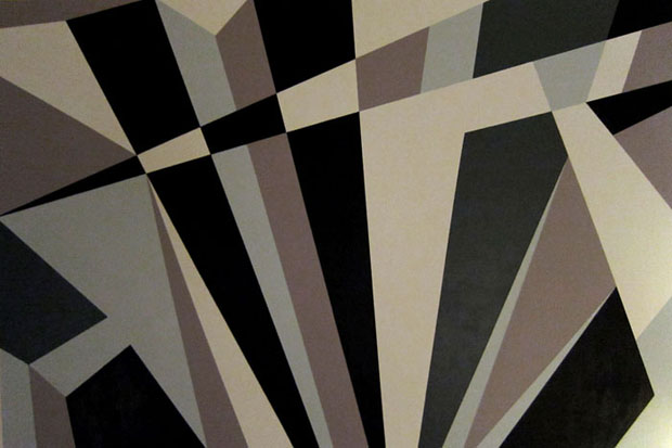
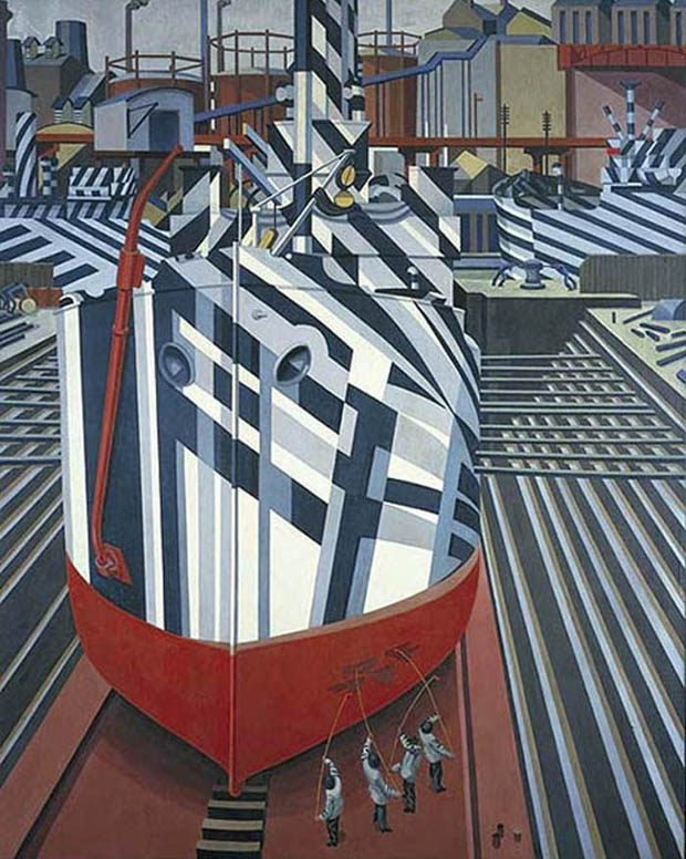
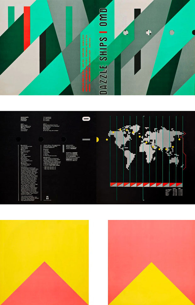
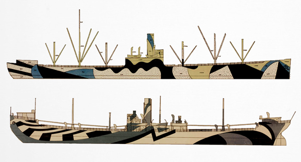
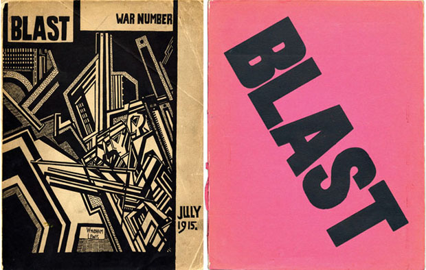
I've just finished the second in a series of dazzle camouflage canvases. The painting measures 60" x 40" and was created with acrylic paint on canvas. This composition is based on a detail of a dazzle ship photograph by Allie Wojtaszek. The colours derive from original dazzle ship drawings that illustrate this post. In a perfect world I would be happy to keep working on dazzle camouflage paintings for the rest of my life! I love the modernist nature of the patterns and the use of colour, which seems very much of its time. Painting is one of the best reminders we have that the past actually did exist in colour so it's fun to be able to work with a colour palette that existed nearly one hundred years ago. I seem to be getting more and more obsessed with dazzle ships and their history after working on these recent canvases and researching the subject. Dazzle ships are quite a romantic notion to me and the idea of beautifully coloured ships floating over the water in the dark is the sort of warm thought that puts me to sleep at night. There are many ways that pattern-based camouflage has been used, but none are as bizarre as the British dazzle ship designs of World War I and, to a lesser degree, World War II. These were abstract, clashing geometric decorative designs that were applied to battleships in order to confuse viewers, particularly German U-boats, using optical range finders. Although dazzle paintwork is sometimes described as camouflage, it actually wasn’t intended to hide anything in the way regular camouflage does. Instead, it made it difficult to determine important aspects such as shape, distance, speed, and direction. The development of radar in the 1940s made dazzle ship graphics less relevant, but it still crops up here and there. In Austria, speed traps have been camouflaged with dazzle to confuse drivers as to the direction the radar is pointing. Many car prototypes also wear dazzle camouflage during testing to hide the "curves" of the vehicle before the manufacturer is ready to show it to the public. The USS North Carolina is still in dry dock in Willmington, where Blue Velvet was shot, so I hope to be able to take a day trip there soon! Peter Saville famously used Edward Wadsworth's 1919 painting Dazzle Ships In Drydock At Liverpool (shown above) as the inspiration for the Orchestral Manoeuvres in the Dark Dazzle Ships album cover. The original is in the National Gallery of Canada. Peter Saville and Malcolm Garrett of Assorted iMaGes both made their careers by brilliantly reinventing the past during the 80s, producing album covers for Joy Division, New Order, Buzzcocks, Duran Duran, OMD, and Peter Gabriel, amongst others. The original vinyl version of Dazzle Ships uses Peter Saville's distinctive design on the gatefold cover and an information graphic on the inner by Malcolm Garrett. The compact disc re-release uses the same imagery with a completely different colour scheme. Its very difficult to find colour images of the original WWI designs, but they typically used red, green, yellow, and purple, lavender and mauve greys, and black and white. The underlying principles are diagonals, zig-zags, and arcs, combined using sudden changes in the patterns at seemingly random points used to give impressions of different planes or facets on flat surfaces to break up physical lines and shapes. The patterns make it difficult for onlookers to determine which direction the ship is heading. Razzle dazzle deception uses abstractions to cloak the activities of movement by seemingly creating more movement. War has inspired many great artistic moments but artists very rarely return the favour. During World War I, Modernism turned naval fleets into the largest painting canvases in the world. German U-boats were sinking enormous numbers of ships and there was no really effective defence against them. Most camouflage is based on the idea of concealment and blending in with its surroundings. However, there is another school of thought that argued for making the item in question appear to be a camera obscura of unrelated components, which naval camoufleurs found particularly appealing. Blending didn’t work because ships operated in two different and constantly changing colour environments — sea and sky. Any camouflage that concealed in one environment was hugely conspicuous in others. There was very little method in the mass of triangles, parallelograms, and stripes of these colors, but they had certainly been scientifically designed to secure the effect sought for. Military historians have often erroneously connected razzle dazzle with Cubism. The dazzle concept was invented in 1916 by Norman Wilkinson, a British marine painter and naval commander who took inspiration from Cubist and Vorticist paintings. The Vorticists were the English equivalent of the Italian Futurists, and Edward Wadsworth, a leading Vorticist artist, supervised much of this dazzle ship work, overseeing the camouflage of more than two thousand war ships. Razzle dazzle is quite clearly inspired by Vorticism, which is probably the only significant British art movement of the early 20th century, started by Wyndham Lewis, editor of the brilliant but short-lived Blast magazine. Picasso is reported to have taken credit for the modern camouflage experiments, which seemed to him a quintessentially Cubist technique. He is reported to have drawn the connection in a conversation with Gertrude Stein shortly after he first saw a painted cannon trundling through the streets of Paris. However, Cubism was far more concerned with apples, guitars, and life in the cafe while Vorticism was not afraid of looking outside the cafe and observing the architecture surrounding it. Also, there was a hint of aggression, conflict, and Brutalism in most Vorticist works that is entirely missing in French work. Vorticist works are characterised by the unease created by a disrupted perspective, which is a perfect metaphor for dazzle camouflage. Wilkinson believed that breaking up a ship’s silhouette with brightly contrasting geometric designs would make it harder for U-boat captains to determine the ship’s course. While there was a marked decrease in losses to U-boats, historians agree that this reduction was mainly due to the adoption of the convoy system at the same time. Dazzle did, however, boost the morale of allied seamen as well as capture the imagination of artists and the public alike. All British patterns were different, first tested on small wooden models viewed through a periscope in a studio. Most of the model designs were painted by women from London's Royal Academy of Arts. A foreman then scaled up their designs for the real thing. Creative people including sculptors, artists, and set designers also designed camouflage. An observer would find it difficult to know exactly whether the stern or the bow is in view; and it would be equally difficult to estimate whether the observed vessel is moving towards or away from the observer's position. Range finders were based on the coincidence principle with an optical mechanism, operated by a human to compute the range. Dazzle was intended to make that hard because clashing patterns looked abnormal even when the two halves were aligned. As an additional feature, the dazzle pattern usually included a false bow wave intended to make estimation of the ship's speed difficult. This led to more scientific studies of colour options which might enhance camouflage effectiveness. Broken colour systems which present units so small as to be essentially invisible at the distances considered are neither advantageous nor detrimental to the dazzle effect; the visibility of the camouflaged vessel at a given distance would depend entirely upon such scientifically measurable factors as the mean effective reflection factor, hue, and saturation of the surface when considered at various distances. American naval leadership thought dazzle effective and, in 1918, the U.S. Navy adopted it as one of several of their techniques. However effective the scheme was in World War I, dazzle camouflage became less useful as rangefinders and especially aircraft became more advanced, and, by the time it was put to use again in World War II, radar had further reduced its effectiveness. The U.S. Navy implemented a camouflage painting program in World War II, and applied it to many ship classes which were in use until the end of the war. As far as I know dazzle camouflage was never used on any submarines. The British Royal Navy dazzle paint schemes also reappeared in January 1940; these were unofficial and competitions were often held between ships for the best camouflage patterns. The Royal Navy Camouflage Department came up with a scheme devised by wildlife artist Peter Scott, and developed it into the Western Approaches Schemes. The German Navy first used camouflage in the 1940 Norwegian campaign. A wide range of patterns were authorised, but most commonly black and white diagonal stripes were used. Most patterns were designed to hide ships in harbour or near the coast; they were often painted over with plain grey when operating in the Atlantic. At first glance, dazzle seems an unlikely form of camouflage, drawing attention to the ship rather than hiding it. However, dazzle did not conceal the ship but made it difficult for the enemy to estimate its type, size, speed, and heading. The idea was to disrupt the visual rangefinders used for naval artillery. Its purpose was confusion rather than concealment. The artist Abbott Handerson Thayer did carry out an experiment on dazzle camouflage, but it failed to show any reliable advantage of dazzle over plain paintwork. In a 1919 lecture, Norman Wilkinson explained: "The primary object of this scheme was not so much to cause the enemy to miss his shot when actually in firing position, but to mislead him, when the ship was first sighted, as to the correct position to take up. Dazzle is method to produce an effect by paint in such a way that all accepted forms of a ship are broken up by masses of strongly contrasted colour, consequently making it a matter of difficulty for a submarine to decide on the exact course of the vessel to be attacked. When making a design for a vessel, vertical lines were largely avoided. Sloping lines, curves and stripes are by far the best and give greater distortion."
|
|

